Your product or service is great.
But for all the effort you’ve put in to get traffic to your landing page, they just aren’t signing up.
Or at least not as many as you think should.
It’s this one major hurdle that prevents many businesses from reaching comfortable profitability, and growing consistently as they should.
If this sound like you and your business, I have the solution: Landing page optimization.
Not just changing the color of a button, but a methodical process for increasing conversion rates on your landing pages as much as possible.
We’ll be going through a process that you can follow to increase your landing page conversion rate over and over.
The Basics: What is a Landing Page?
The technical definition of a landing page is any page that a visitor first visits on your site; they “land” on it.
The modern interpretation of a landing page, especially in the context of a business, is much different.
A landing page is a page on your website with one specific goal: to get a user to perform one specific action.
The most common job for a landing page is to get a visitor to fill out a basic email form and submit it. From there, you can use their information to move them through your sales funnel.
You should be sending most of your cold traffic to a landing page (when possible), because once you have their information, you can direct them around your site as you deem fit.
Step 1: Zero In On Your Ideal Customer
Some call it empathy, others call it market research.
What it comes down to is understanding your target audience.
If you don’t know how your target audience perceives the problem you are trying to solve, how can you even attempt to write persuasive copy that resonates with them? You can’t.
There are two main areas of your audience that you need to research in order to build a complete customer profile.
Customer Demographics
Demographics are the cold hard facts about your target market.
Questions you should be able to answer about your ideal customer:
- How old are they?
- Where do they live?
- How much income do they have?
- Are they male or female?
- What is their level of education?
Customer Psychographics
Psychographics, on the other hand, are more subjective.
Psychographics describe your ideal customer’s attitude, lifestyle, values, and behaviors. Here are some questions you should be able to answer about your customer:
- What are their top priorities in life? E.g., health, adventure, etc.
- What do they use the Internet for? Just email? Social media? Business?
- What are their hobbies?
- Do they value quality over quantity?
- Where do they find fulfillment in life?
- What language (words and phrases) do they use to describe the problem you solve?
These are just some psychographics that you might want to consider. The more detail you can gather about your target market’s behaviors and thoughts, the more you will understand them, and the easier it will be to create a landing page that resonates with their pains and needs.
How Do You Find Out Your Customer Demographics and Psychographics?
Your first step is to identify your ideal customer. It’s likely that you already know who that is from your past customers. Start there.
If you can go through 50 or more customers and profile their demographics and psychographics, you’ll start to notice some really important patterns that you’ll need later on in this optimization process.
But back to the question: How do you actually get your data?
Here are the 4 most common ways to do so. Feel free to use one or more of them as needed to create a full customer profile.
- Analytics
Google Analytics (GA) is a goldmine for demographic information. All you need to do is explore the “Audience > Demographics” tab.
Furthermore, GA can also be useful to learn about your customer’s behavior, assuming you have sufficient traffic for meaningful conclusions.
Start by looking at:
- which pages they spend the most time on
- which traffic sources convert best
- which type of content (on your blog) they are most interested in
You likely won’t get a full picture of your customers, but it’s a great start.
- Surveys
Send an email to your customers with a link to a survey asking them to fill it out. If you’re worried about low response rates, offer some sort of reward; it’s worth it.
Here’s a sample survey that focuses on psychographics:

There’s no right or wrong question to ask. Just try to fill in any blank areas of your customer profile.
Tip: There’s one big problem with the sample survey above. When it comes to psychographic information, it’s usually best to ask open ended questions. Don’t limit your customer to answers that might not best describe their thoughts.
- Interviews
There’s no substitute for getting on a call with someone for 10-20 minutes. Find a way to incentivize some of your customers (gift cards, product discount, etc.) if they’ll agree to talk with you.
- Online Research
Spend time on sites like Quora and relevant subreddits of Reddit to see what kind of questions and answers people in your niche have.
For example, if I was selling a dog training product, I would search for dog training and follow the topic:
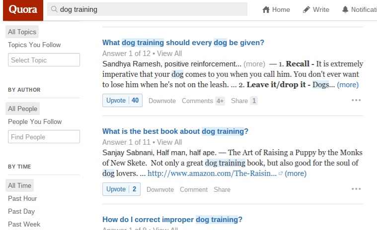
Even from just these three questions, I can start to see some of the language used to describe problems: “positive reinforcement,” commands, and “crate training.”
Let’s head over to Reddit to the /r/dogtraining subreddit. While checking the newest/hot links is a good idea, it’s best to start by clicking “top” on the navigation menu, which brings up the top threads of all time:

Because these are the most upvoted threads on the site, you automatically know that this content and the language used resonates with your target audience.
Add any common words or phrases to your list, and check out what type of content they like (length, format, design, etc.).
Step 2: Install Analytics (if you haven’t already)
Optimization is not a guessing game. That’s not up for debate.
Every hypothesis that you make, and every test that you run must be based on data.
Most businesses have GA installed, which is a good start. Set up your goals and sales funnel to get data that is meaningful,
It’s up to you to determine if you’d like to invest more in analytics. More advanced software like KISSmetrics can help you gain deeper insights into the actions of particular users on your landing page.
In addition, collecting heatmaps using software like CrazyEgg is a great way to record data relating to user interaction.
While these products have a relatively small cost associated with them, the conversion increases you can achieve as a result of the tools far exceed the cost if you have any significant revenue.
Step 3: Optimize Your Page For Its Traffic Sources
Here’s a big mistake that many businesses make with PPC ads.
They work to create a compelling ad that achieves a high click-through rate, but as they do that, the message in the ad no longer matches the message on the landing page.
Let’s look at an example…
I searched for “dog training” in Google and clicked on this sidebar ad:

It’s titled “potty training your dog.” Not bad. I’m guessing a lot of people looking to train their dog are looking to potty train them.
Here’s where it goes wrong. When I click the ad, this is the landing page (click to enlarge):

A cluttered page with the title “Puppy Apartment” and a Youtube video.
“I was looking for information about potty training my dog, not about a puppy apartment…” (proceeds to close window)
Your landing page must match your ad as closely as possible. When you can, give it the exact same title.
If necessary, create more than one version of a landing page with different titles.
What About Other Traffic Sources?
PPC traffic is the most common source where having a bad match is an issue, but it’s not the only one.
If your landing page manages to rank well organically in search, make sure that your meta title and description match what’s on the page.
Any time you drive traffic to a landing page, the messages must match.
Guest posting can be a great way to drive traffic to a landing page with a call-to-action at the end of the article. Here’s an example of it being done right:
Guest posting can be a great way to drive traffic to a landing page with a call-to-action at the end of the article. Here’s an example of it being done right:
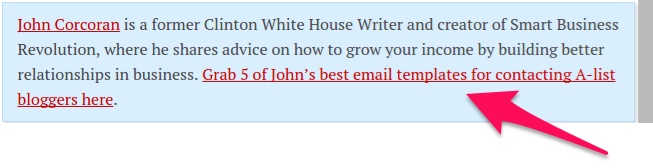
When you click the link for the 5 free templates, it takes you to a page where this is the only content you see:

Anyone who visited the landing page got exactly what they wanted.
Step 4: Evaluate Your Value Proposition
You can drive traffic to any landing page if you have the resources, but if you don’t have an offer that appeals to anyone, your conversion rate will suck.
You likely already have your offer created, or at least in mind. But that’s only one half of the issue.
The other half is how you present your offer.
Crafting a great headline is a big part of it, but all the copy and images on your landing page contribute to your value proposition.
Explain Your Value in a Headline
You only have a few seconds to capture a reader’s attention.
If you can write a headline that matches what the reader is looking for, you get a chance to present your product in more detail.
The most important key is to explain your value in simple terms, with the language that your readers are used to (remember when you wrote that down in step 1?). Be clear and concise. If possible, include a benefit.
Your landing page headling should explain your value simply, be clear and concise, & include a benefit.
Check out this landing page for CodeAcademy, a great site for beginner programmers:
Check out this landing page for CodeAcademy, a great site for beginner programmers:

“Learn to code interactively, for free.”
Analysis: When someone lands on that page, it’s because they are trying to learn how to become a programmer. Most are also not interested in buying an expensive course or enrolling at a school.
This simple headline demonstrates that a student can sign up and learn for free, and that it will be interactive instruction (not just reading a book).
One short sentence communicates the main purpose of Code Academy (learn to code), a major benefit (interactive teaching), and a secondary benefit that is a potential obstacle (price).
What Does Your Product or Service Contain?
You’ve got their attention, and they understand the value you provide — great start.
This might be enough to get many readers to convert.
However, a large percentage of readers will want more details. In other words, how are you going to deliver on your promise?
There are a few different ways you can do this:
- An explainer video: Explainer videos can do wonders for conversion. They’re a great way to take a complex topic and break it down quickly in a visually stimulating way.
- A demo: If your product or service is web-based, consider showing visitors exactly how it works in a real situation. Bonus points if you can customize it for the visitor’s website or situation.
- Written explanation (usually bullet points): Some products are easiest to explain through text. Why bullet points? They’re easy to skim and read through. Take a look at this free design ebook landing page by HubSpot and Unbounce.
Step 5: Is the Copy Compelling?
Our landing page is really starting to come together.
You’re saying the right things, but that doesn’t mean you’re saying them in the right way.
Writing persuading copy can be the difference between an “okay” conversion rate and a “great” conversion rate.
The problem is that it’s not exactly easy. I’ll be honest, short of hiring an expert copywriter, you probably will not be able to maximize your conversion rate.
However, there are still a few small things you can do to achieve a solid level of compelling content.
Should You Describe the Problem?
You might have read in the past that you should use descriptive language to stress emotions that will compel readers to take action.
It’s good advice, but it’s not 100% correct.
Have you ever broken a bone?
If you have, chances are you didn’t need someone telling you about living in agony and being in pain 24/7. You knew that you needed it fixed. If necessary, you looked up a hospital that could treat broken bones.
If your target audience already knows the problem you are solving is a problem, you don’t need to say much to remind them.
On the other hand, if you solve a problem that people often live with because it only occasionally causes them to suffer, you do want to describe the problem.
You want to bring up those feelings of frustration, pain, or discomfort that they get when faced with the problem in their life.
The primary way to do this is with text or images.
Going back to a dog with potty-training issues. This is a problem that comes up fairly often but probably not every day. The owner might hold out some hope that the dog grows out of this bad behavior.
Since the problem isn’t always on the owner’s mind, it’d be wise to “twist the knife” a little bit. Here’s a sample opening for a dog training product I might use:
“Urine stains on the couch… the carpet… your bed. I love the furry guy but why does he do this to me? I’ve wasted hundreds of dollars and dozens of hours cleaning up after him and trying to teach him, but the results are always the same.When I come home from work, before I even open the door, I already know what to expect…Does this sound familiar?”
I don’t know the problem all that well, so ideally it would be more descriptive, but this is what you should be aiming for. Illustrate the problem, and describe the emotions felt during the problem. Then transition into how your product can alleviate that pain.
Alternatively, remember that an image can say a thousand words. Imagine a picture in the background that sums up the problem; maybe like this:

There are 2 key things to keep in mind here:
- Use the language your readers use: Remember all those words and phrases from step 1 that you wrote down? Now’s the time to use them. It’s how you get readers nodding their head in agreement as they read. For example, many dog owners might say “another carpet ruined” (just an example phrase). This is a phrase that I would make sure to include.
- Use trigger words: Describing emotions is hard. Depending on the emotion you are trying to bring to life, you can use different trigger words that make most people think of those feelings. Here are 50 trigger words and phrasesfrom CopyBlogger.
Step 6: What Do You Want the Reader to Do?
Every step until now has contributed to understanding your readers and framing your message in the right way.
But once you achieve that resonance, you need to get your reader to take action.
If it’s not obvious what you want your reader to do or why they must do it, you’ve automatically lost a huge chunk of your conversions.
Here’s what you need to do:
- tell readers what you want them to do
- tell them what’s in it for them
- make it obvious (put it above the fold and make it stand out)
- make it simple (don’t have a 20 field opt-in form)
Take a look at Groupon’s home page:

It’s a simple page, but very well done.
It’s obvious that they want you to enter your email address (big, bold headline). It’s also clear what I get as a reader — unbeatable deals.
Finally, it’s also simple, just a single field at first.
There’s one problem with that Groupon page: a weak call to action.
While the design is good, a label of “continue” is almost as bad as “submit” or “order.” Instead, write something that provokes action and communicates value. In the case of Groupon, I suspect “I want the deals” or “Show me the deals” would convert higher.
I recommend Neil’s great guide to creating an effective call-to-action button for further reading.
Step 7: Why Should Users Trust You?
People are social creatures. We value other’s opinion, especially when we buy.
There are a few ways you can inspire trust and confidence in visitors who are a little unsure of if they should buy from you.
Option 1: Testimonials
Testimonials are a great way to quickly showcase a positive opinion from a happy customer. While they help, some visitors are wary that they are fake, because it’d be so easy to do it.
Don't fake testimonials. It's usually easy to tell it's not authentic.
It helps if that customer is someone that is well-known in your industry, as opposed to “John from Canada.”
It helps if that customer is someone that is well-known in your industry, as opposed to “John from Canada.”
Option 2: Social Proof
If you can show that you’re an expert or that your product has been featured by major brands, do it.
Here’s how Unbounce displays their social proof and testimonials:

If you’re not sure if any big names have mentioned you, just search your site on Ahrefs, click on “Referring Domains,” then sort by domain rank (DR):

Option 3: Trust Seals
An Econsultancy survey showed that “trustmarks” (a.k.a. trust seals) are one of the most important components to consumer trust:
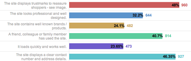
Many online shoppers are wary of giving personal information when purchasing a product. Trust seals are simple graphics that help reassure that your site is protected against viruses and malware.
Refer to this guide on choosing the right trust seals to see which ones users actually care about.
Option 4: Case Studies
Case studies are testimonials on steroids.
While you’ll likely have to hire a writer to put them together for you, case studies are great ways to convince potential customers who are on the edge to try or buy your product.
HubSpot is one of the best I’ve seen at showcasing a variety of high quality testimonials. I encourage you to go take a look if you’re curious about what they entail:

Step 8: Evaluate Your User Experience
A poor user experience will result in a poor conversion rate.
What I mean by user experience, in this context, is how clear is the information on your page.
This is the time to de-clutter. Get rid of:
- pictures that don’t add to your message
- navigational menus (you want them to stay on this landing page)
- any distracting features of your design
In addition, make sure that all your text is easy to read. The safe choice is always black text on a white background, even though other color schemes can work with no negative effects. (Test for best results.)
Finally, check your landing page from multiple browsers and multiple devices. Your landing page should be responsive.
Get Real Life Feedback
So far, we’ve created a landing page based on a lot of solid theory and research.
But no matter how much research you do, the real test comes from real users. It’s impossible for you or others working at your business to perfectly get inside a target customer’s head.
Option 1: Live user testing
The ideal testing scenario would be watching potential customers as they come to your landing page. If you can somehow make this happen by creating a focus group, that’s great.
Most businesses can’t arrange that, so you might have to be more creative. One tool that you can use is Five Second Test.
Here’s how it works: You upload a landing page, and then members of the community are shown your page for 5 seconds. You can ask questions about their initial impression and if they understood your value proposition.
It’s a neat tool, but it’s only going to be one part of your assessment.
Option 2: Analytics
Your basic user analytics can give you data like bounce rate and time on page, but the more useful data in this situation is from your heatmap tool, like Crazy Egg.
A heatmap will show you what visitors are paying the most attention to, and even how far they are scrolling down your page.

If you predicted user behavior correctly, there should be a lot of attention on your headline, copy, and call to action.
If not, you’ll see attention on the background or header. Sometimes, you’ll see that some of your copy that is high on the page is mostly skipped over, indicating that it’s not as important to your potential customer as you thought. Alternatively, sometimes text or images down below gets a lot of attention and should be moved up.
Step 9: Begin Split Testing
At this point you have your page and a little bit of feedback.
No matter how good you are at designing landing pages, your conversion rate can be improved by split testing.
Before you being any testing, make sure you create a complete conversion rate optimization plan.
Before you being any testing, make sure you create a complete conversion rate optimization plan.
Look at your heatmap data and user feedback in order to come up with hypotheses to test. If you notice that your call-to-action button isn’t getting enough attention, you need to figure out why:
- Does the color not stand out?
- Is the text too bland?
- Does your user not understand what they’re getting?
- Is it too small?
You may end up with several ideas of changes you can test. Design identical versions of the landing page, but change the one detail you think could be improved. Split your traffic to each page and see which one produces a better conversion rate.
Repeat this process over and over, and you will see an amazing increase in conversion rate as your landing page becomes more and more optimized.
Conclusion
Optimizing landing pages properly takes a lot of time and effort.
That being said, doing it right could be the difference between a healthy, growing business, and a business that can’t achieve profitability at all.
Do you have any questions about landing pages? Leave us a comment below and we’ll try our best to answer them.
To view the original article Click Here
No comments:
Post a Comment