
The difference between a Reporting Squirrel and Analysis Ninja? Insights.
As in, the former is in the business of providing data, the latter in the business of understanding the performance implied by the data. That understanding leads to insights about why the performance occurred, which leads to so what we should do.
Do you see how far away a Reporting Squirrel's job is from that of an Analysis Ninja?
For one, I hope you see the massive investment in self-development of business skills required to have the foundation required to get to the why and, even more, the so what.
Pause. Reflect on the implication of that why and so what on your current skills/career.
I'm sure you came up with a set of actions you can take to evolve from a squirrel to a ninja, or, if you are already a ninja, how to become even more awesome at ninja'ness.
One of the actions that both clusters will come up with is the ability to communicate the insights you discover. Even if you have really amazing why and so what, I've observed many Analysts die at the last mile: Presenting their whys and the so whats, in the form of stories.
In fact 86.4% of all Analyst careers fail due to a lack of this critical last mile skill!

Ok, ok. I kid. I kid.
It is really 88%. : )
Tom Fishburne's wonderful cartoon is here for another purpose.
We send out our multi-tab spreadsheets, our best Google Analytics custom reports, our great dashboards full of data , and more to the tactical layer of data clients. The Directors, the Marketers, the Optimization employees and our resident social media gurus. The valiant hope is that they will do something.
But, as Tom illustrates above, some of our most important meetings, where data is the hero, are where you have to stand up and deliver your amazing discoveries as an Analyst using Keynote or PowerPoint. These meetings are important because you can't data puke (PowerPoint is not a great medium for that, not that you are not going try! :)), you have to present to perhaps the most important people at your company or client and they likely can do something about your career should you stink. The focus, hence, is on telling stories.
In this post, I want to address this specific use case. You are standing in front of a group of people, and your goal is to communicate your incredible brilliance (specifically the why behind the data, and the so whats ). We are going to discuss a cluster of strategies you can use to ensure that you present your message with radical simplicity and with an incredible focus. You goal is going to be to present your why and so what so quickly that the attention moves away from the data and on to a discussion. Yes. You are going to make the data a sideshow – in the meeting where the data is supposed to be the hero. Because, data is not the hero, the actions you'll take are the hero.
Before we go on…
Challenging Conventional Wisdom.
Let me make a career-limiting move and disagree with two things that Major Big Gurus have made into conventional wisdom. I'm sure there will be blow-back. But. These are absolutely corrosive points of view.
PowerPoint does not suck, you do.
It is conventional wisdom that PowerPoint sucks. That using slides is the problem in telling stories. That the reason you are long and boring just happens to be the thing projecting from your computer.
This is bonkers.
Do you blame your razor when you cut your face, legs or other regions? No, you are smarter than that.
PowerPoint is just a tool. You can cut yourself with it and embarrass yourself, or you can look the very best you ever have by using it optimally.
Judge people who say "Keynote is evil", "Let's ban PowerPoint to get better stories", or "OMG, that was an amazing PowerPoint presentation!" (No, it was not. The storyteller and the story were amazing.)
Don't limit the number of slides, limit the number of ideas!
I'm sure you've heard it from your boss: "You can only present 10 slides!" There are golden rules: "12 slides for 30 mins!"
It is understandable why Major Big Gurus give this advice. Many people do present too many slides in the time they have. But, the reason this is a crazy is that if someone has 35 slides and you tell them they can only have 12, they will, like good people throw away five, but then they will put the content of the remaining 30 slides on 12. See, all fixed.
No!
The thing sucks even more now.
Limit the number of ideas people can present. That is the problem. That is why there are too many slides. Here's my rule for our team: If you have 60 mins, you can present 3 stories with each story making one big point. You'll tell them in 40 mins, leaving 20 for conversation.
Now, you've set them free from a silly number of slides obsession. They can only present three strong ideas. If their presentation style can allow them to present that well in 900 slides, that's ok. If their presentation slide means they can tell three stories in 15 slides, so be it.
By limiting the number of ideas, you've created the right incentive for them.
Don't listen to Major Big Gurus and blame PowerPoint or try to limit the wrong thing. Glory will be yours.
Ten rules to improve storytelling with data.
With those critical challenges to conventional wisdom out of the way, let's look at ten examples of data/insights presented via Keynote or PowerPoint and learn how to improve your effectiveness significantly. Our BFFs will drastic simplicity, incredible focus. We will apply liberal doses of our good taste, and common sense. The goal will be to get to the point faster, and move the conversation away from the data to what should be done.
Here are the ten lessons, in case you want to jump ahead (but why!):
1. Don't suck twice, stop creating handouts.
2. Take everything away except the absolute essential.
3. Avoid complex visualizations – they get in the way!
4. Make performance comparisons easier!
5. Convert words into pictures, and expose complexity.
6. Deeply resist, dislike, prettification for the sake of it.
7. Don't make a deal with the devil, stock photos are evil.
8. Leverage proportionality for higher-impact stories.
9. Look beyond the obvious, really look.
10. When faced with a data puke, pick focusing facts!
The examples used below come from public presentations by various tool providers, industry analyst outputs, and other such sources. In almost all cases, except were unavoidable, they have been stripped of source identifiers and anonymized. Because it is not important where they come from, just pop open your personal slides folder and you likely don't have to go very far to find very similar examples. :)
It is important to share that my goal is not for you to create outputs that look exactly like the afterversions below. My goal is that you'll learn a set of filters you'll use as you think about the best ways to create your stories, however you choose to tell them with whatever visual output you most love.
Ready? Let's go have an immersive learning experience and have a ton of fun! Ten lessons in simplicity and focus that help us become better storytellers…
#1. Don't suck twice, stop creating handouts.
The single biggest mistake we make when we present data: We create handouts! The text/data rich horrid creations whose primary purpose in life it to try and work when emailed out.

When you do this, you've decided to suck twice. First, when you present it (people can read faster than you can talk, you are going to read these slides word for word driving the audience to wish for a painless immediate death). Second, when you email out your 58 slide data stuffed monstrosity, no one will read it.
Don't create handouts. Instantly you suck less.
Just think about it. This slide is on the screen…. What thoughts are going through your head?

Perhaps, the sadness at the 20 mins it will require you to understand this. Perhaps, marveling at the creator's extraordinary ability to not leave any area unstuffed. Perhaps, the fact that the proverbial joke starts with the punch line. Perhaps, wondering if everything is already on the slide, why are you listening to someone reading it – why did they simply not email it to you?
Don't create handouts. Retain the respect of your audience.
Handouts can take all shapes, here's one used on TV while an Insights Analyst, not kidding, was talking in a small box on the screen…
Do you need the first two lines? The TV person was talking them any way. Do you need all the super cutified ball-piller things? Do you need the pimpy thing at the bottom (which was also scrolling by the screen).
Handouts. Don't do them. You mom will love you more.
#2. Take everything away except the absolute essential.
Actually, there are two lessons in this story. One, getting to the absolute essential. Two, developing a life-saving obsession with outcomes. (You'll see this obsession of mine threaded throughout this post. It is absolutely critical for Analysis Ninjas.)
When you are presenting, to an audience of 3 or 3,000, your goal should be to get the data out of the way as fast as you can, so that you can move to the so what conversation. If your discussions are constantly getting stymied in data quality issues, arguments about formulas, tool questions, and the this and that of data, you are doing it wrong. All that needs to happen prior to to you standing in front of the group.
Here is a fantastic example of good intentions going awry…

Take 30 seconds, ponder what's going on. You are a Ninja, it will likely take you less. I'm sure you'll come to two conclusions. First, someone worked really hard on this and created a really nice model for a smarter decision to be made for 2014. Second, you'll wonder if it was necessary to open the kimono this wide and expose yourself quite this openly.
The above slide, remember, good work, great intent, will simply lead to a discussion of the data. The puke of rows and sub-rows, are trying way too hard to earn credibility. Someone is going to pick something small and distract the whole freaking discussion down some freaking rabbit-hole.
There is one other problem. It is hidden. Scroll back up a bit, look at the image, did the Analyst make clear what they wanted to business leader/HiPPO to do? How could they, the Ninja in you has already noticed that there is no impact on the business above.
It is important to re-state that a lot of work was done on the slide above, but a wonderfully qualified person. That is what makes the output heartbreaking.
Ok. Let's fix it.
The easiest way to start is to take away elements that are cluttering the story.
In this case, you simply get rid of the sub-rows with the tiny fonts. They were not adding much value to the overall story (and screaming: I AM CREDIBLE, TRUST ME, LOOK AT ALL THIS DETAILED DATA!!!).
Here's the resulting output..

Simpler, right? Scroll back up, compare the two versions. Just, less stuff.
Don't underestimate the value of this strategy in your storytelling. Just. Less. Stuff.
Let's apply that principle again. You'll notice above that there are some numbers that are repeated multiple times. Why do we need them cluttering our story? Why not get rid of them? Oh, and impression share really adding value?
Here's an even less stuff view…

OMG! Less stuff rules! :)
You can present this slide, and you'll look like a champ. It tells the story you originally wanted to, in a simple and focused manner.
But, now that all the data clutter is gone, you'll start to see the problems you should have been worried about in the first place.
For example, it is a mistake of the most gigantic proportions to end any analysis on Investment Required. Rookie mistake. No boss/client wants the story to end on money going out. They want to know how much money is coming into the business!
You'll want to do that. It will make you realize you have no idea what the value of a Raw Contact it. You go and figure it out (yes, it is your job to compute economic value ).
It will take you a while, but you are going to die of happiness when you do finish the task.
When you have it, you'll move investment to the very top (it is what causes the rest to happen after all), and add two more rows at the bottom…
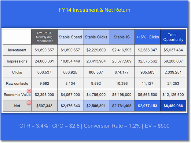
How cool is this? Attention is now shifted to what the company is actually going to get out of that investment (Economic Value minus Investment).
As the room now considers if we should go for stable spend or clicks or impressions or more clicks, they can see how much more comes to to bottom-line from each decision. A smart discussion ensues.
There is one more thing left.
You are the smartest person in the room when it comes to data. You've done lots of deep dive analysis (hence v1.0 of your data-rich slide!). You understand a good amount of how this area of marketing works, you understand the company's goals.
Why not use all that knowledge to make a recommendation in terms of what the company should choose?
Tighten the slide up just a bit, and put a ring on it…

Now, your boss, directors, VPs, everyone has a simple view of the data (even with all the numbers!), and they know exactly what you want them to do.
They might not agree with it. But, that's beside the point. You would have successfully moved the discussion away from the data and on to dealing with the so what. They'll argue about why not go for stable impression share or clicks, or, since they are so smart, why not go for total opportunity (how dare you not shoot for six mil!). All, very good discussion about the business, and not the data.
#winning
I hope you see that while we are fixing the slide, we really did so much more than that. We ended up in a place with a lot more business analysis, and you had to work harder to develop a point of view on what to do. We added to your analytical skills a demand for business savvy. That's what makes an Analysis Ninja (and simpler slides).
#3. Avoid complex visualizations – they get in the way!
The general belief that we need to visualize data is well founded. Lots of numbers look burdensome, and can often be boring (especially if your story has lots of these slides). You don't have to go very far, just scroll up a bit in this post. :)
But, often, despite our good intentions, we end up in a much worse situation when we deploy an extra-layer of effort to create something visual.
Here's a fantastic example of that…
How hard did you have to work to figure out what was going on here? Here are some reasons why it was way harder than necessary.
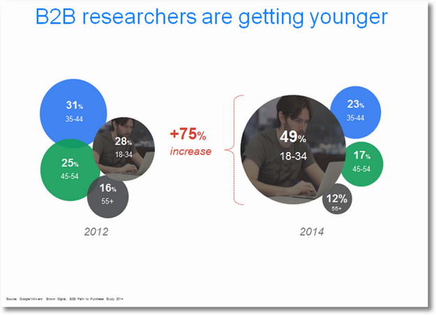
Add this to your rule-book, don't ever do percentages of percentages. It is very hard for people to get a real concrete sense for what's going on. In this case, 49% is 75% more of 28% is hard to get.
I'm sure you are wondering why the red parenthesis was used, it seems to imply that 49% is less than 28% (or all of the right is less than the left).
Surely you are curious why the lovely hipster gentleman in a t-shirt was necessary to communicate with B2B bosses.
At this point your head also hurts as you tried to commit to memory all the numbers so that you can compute the difference between each bubble.
Net, net. A delightful mess. The visualization actually gets in the way (besides the extra money you spent doing the work of making the bubbles and finding the optimal hipster).
This is a lot less pretty, but a lot more effective…
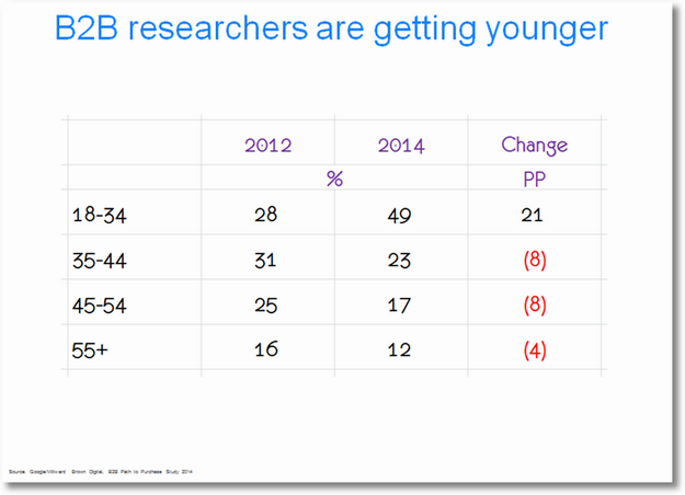
The use of colors helps drag your eye to the column that's actually important, the red is effective at giving the core message (I should have made the 21 green, dang!), and the percentage points are simpler to internalize.
Of course, to send your core message, you might decide you don't need the numbers for each year, you can further simplify…

No hipster, red parenthesis, or bubbles, but makes your point for you.
At this point, you have your choice. You can keep using the percentage point change, or you can switch to percentages. Either one works really well, because that column of numbers is all by itself…
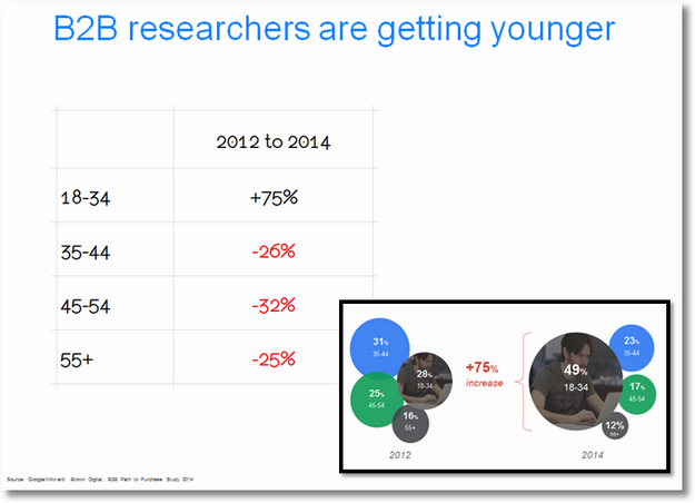
Compare the more time-consuming, bubble-hipster original with the table. I've heard some say that the bubble-hipster is cooler. If that is you, I want you to focus on which one is easier to understand.
Your primary objective is to make sure performance is understood quickly, and you can move to the so what faster.
We are surrounded by such bubble-hipster efforts. Time-consuming anti-understanding look-at-me-I'm-so-cool visualizations that get in the way.
Take a deep breath, find a teddy bear to cuddle for emotional solace as I unleash the next example on you.
Teddy ready?
Take a look at this incredible craziness…

Dear lords of Saturn and Jupiter, what the heck is this!!! Old timey gas station pumps? A new race of aliens?
The visualization is getting in the way. While all slides in this post are shrunk to fit the width of this blog, even in it's full version, projected on a giant screen, it is hard to understand what's being communicated. And, remember, the thing you are looking at above took a lot of time to do, and it does have some good insights. Sadly, the visualization above is like cutting your legs off to run faster.
There are 50 ways to do this right/differently. I'm sure you can think of 40 of them. Let me share two.
For my first attempt, I tried to separate the two distinct things that were being communicated using the three different numbers above. When I presented the data, I showed the data in the blue (current ratings) and then click my mouse and the second set of data in the orange comes into view…

By not showing all the data at the same time, I control the pace of the story, and also spring a surprise on the audience. It turns out the biggest numbers on the right, do not indicate the best.
And, just look at Fox! Foxy!!
When you do this, you'll have to figure out what to do the sort on. I choose YOY Change for my sort (worst to best) as I thought that was the more important thing to drive the conversation.
You can sort the above by Reach. Quite ok. But, in a very subtle way, you'll drive a different conversation.
There is no wrong answer, your local knowledge will help you pick the right thing to focus on. It is important to pick though, don't be random about it.
And, just to prove to you that a good old table sometimes can be better than a ugly over-worked visualization, here's a table version…

The Conditional Formatting (Excel: Home > Conditional Formatting > Color Scales), is there to just draw your eye as an audience to where I want it to be to tell my story quickly and efficiently.
Better than the thing we started with, right?
Data visualization is always a good thing to consider. But. Don't let what you create cross your own boundaries of good-taste and common-sense. Don't let the visualization get in the way of the story you are trying to tell.
#4. Make performance comparisons easier!
I'm sure you are catching on by now that the slides and names have been changed to protect the innocent. And, the normal crud that pollutes a slide (logos, ugly template design elements, confidentiality declarations, company fonts) have also been removed for the same reason (and because I did not want you to weep when you see how much more hideous these slides would be with all that added in).
Ok. Take a look at this slide. Don't scroll. Just take a look at it, do you understand what it is saying? Write it down in just a few words on a post-it.

The design and layout are quite simple, definite kudos to the Analyst for that. Despite that, I bet it was still harder than necessary for you to figure out what is going on.
The reason is quite simple. We are trying two sets of comparisons. First, between RB and a collection of it's peers. Second, between 2012 and 2013. That's hard enough. But, the way the design is accomplished, you have to make too many hops to make the comparison.
For example, to understand Aquantive you have to leap over Flurry and Yahoo! to look at all the data. Maybe this is less difficult because of the huge bars, but it is difficult to do for Flurry and Yahoo!'s performance.
It is not all that hard to fix though. Just put the relevant set's of data together…

Easier to compare, right? I use animations to control the story, so things appear on screen as I'm talking about them (rather than puking out the whole slide at a time and allowing people to roam free and stop listening to me). Hence, the first view will look like above. It allows me to just focus on one thing: Aquantive.
You'll notice that the scale is gone. It is by design. It was hard for me to let go of it as some part of me as an Analyst always wants that there. But, look at the slide above. Does it really matter if the scale is there or not? Especially, if I know that the other bars are coming. Check out the whole slide, does it matter if the scale is there or not?

It is completely irrelevant. You are just comparing performance, and the numbers would only clutter the slide. When I present it, I'll say something like "Our peak investment, in Aquantive in 2013, was 700k." That gives the audience an anchor. Rest is irrelevant.
(Now, I know this is going to be hard for you to do. You can have the scale there if it will make you feel better. It really is ok. You don't have to go that far to de-clutter slides, if you'll be uncomfortable. But, do try it sometimes.)
Bottom-line, but moving things around you've made the data much easier to understand and allowed three companies to be looked at independently, even as they give context to each other.
Remember the common theme in this post? An obsession with outcomes.
What's the so what of the above collection of data?
In the original presentation it moved on to a whole bunch more points, and then in the end the Marketer made a random set of recommendations that could not be tied to the above (or really much of the) data provided.
As a great Analysis Ninja, you want to add one more thing to the slide.
You are comparing 2012 and 2013, add a row of data at the top that shows your computation of the size of the opportunity for 2014.
Boom!

Based on just the data you originally had, the conversation could have gone in five different directions. But, but adding that row on the top you've brought extreme focus to the conversation around the table.
Past performance is ok, but if you just had that you all might just talk about Aquantive and how much you out-stripped peer-set in 2013. Now, you are all going to discuss what your strategy should be with Flurry as you both stink-compared to your peer-set, perhaps not having taken mobile seriously, and it is where the biggest opportunity is. By more than 2X!
That is the power of obsessing about outcomes – the last mile.
This is optional. Sometimes you might not have the expertise to bring this to the table. Let me assure you that that is A-OK (though, over time I encourage you to build these business skills). But, complete all of the last mile.
Add a slide that comes after the one above, this one tells the company what four things they need to do in order to take full advantage of the 90 million opportunity size.
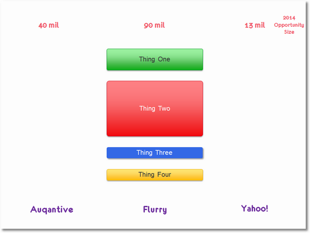
Each recommendation you make is sized by how much of the opportunity it can deliver. At the very minimum you are guaranteed a sign-off from your boss for Thing One and Think Two. They are too big to ignore.
We end up with two slides instead of one. You put the recommendations of what to do, close to the data (rather than dump them all at the end). You present a complete story, you drive a very focused and productive discussion where the only thing data did is got out of the way quickly.
You might not believe me, but these strategies also cut the meeting time by 50% easily. Now, that's priceless.
#5. Convert words into pictures, and expose complexity.
When you try and tell stories, sometimes it is not a matter of just have as few things on the slide as you possibly can. You will a lot of the time. But, sometimes you simply have to show the complexity that lays just below the surface.
Here's a fantastic example of that… Don't scroll too far, take a look at the below slide, you are presenting it to a group of Sr. Leaders, does it communicate effectively the key point you are hoping to make with the three big numbers? Write down your thought's on a Post-It.
(The best way to learn is to come up with your answer, contrast it with the other person's. Regardless of who is right or better, understanding the contrast is where learning occurs.)
Ok. Got your thoughts down?

I love these three numbers. And, I'm often in pain when I think about how few businesses are structured around taking advantage of this. We still live in an world where we are optimize for single visit sessions. If that single visit is a success, hurray! If it is not, trash!
This is insane. Companies should optimize for the portfolio of visits (multiple!) leading to a business outcome.
The above slide, IMHO, sadly fails to expose the complexity in this user behavior/journey. That means, it becomes one of a parade of numbers that go by in a presentation with nary a change in business strategy. Because…. the Sr. Leader won't quite get it.
To be fair, the user behavior is described in text format. But, who is going to read it, or even understand it when you speak it?
We can fix the problem quite easily.
Dump the text. Show a representation of the user behavior. I would show each line at one time as I speak (84% click, describe, click 86%, describe, click 56%, describe), and here's how the completed slide would look…

It is the same thing that was described in the text. But, it's visualized simply yet.
It really brings home the point about how conversions are happening at the moment, and that as as a company we might be making insanely bad decisions by relying only on last-click conversion attribution models.
Yes, there is more stuff on the slide. But, it works much, much better.
If you have an audience that is even slightly connected to the digital business, and not Leaders who look at the digital data just once very two years, then you can actually go all out and truly how how users behave on the web…

While there is a lot more stuff on the slide, in each case, as you present it one number's behavior at a time, it does such a wonderful job of showing just how sophisticated, and unpredictable, user behavior it. It will kick off a really powerful conversation that will go well beyond attribution modeling and encompass everything from the campaign strategy, landing pages, abandonment rates and more.
Conversation. A good thing as Martha Stewart would say.
[To come up with the so what for the above user behavior, two posts for you: Multi-Channel Attribution Modeling: The Good, Bad and Ugly Models and Multi-Channel Attribution: Definitions, Models and a Reality Check.]
#6. Deeply resist, dislike, prettification for the sake of it.
This is another common trend when we have the opportunity to present data, we add unnecessary stuff to it. One of the most common forms of this is icons.
Here's a great example of this, check out this slide…
It shows searches in some country in 2019. This is of course a good idea. But, are you seeing the the data, or are the icons staring at you?
Admit it, you did not even notice that the core point of this set of data, as mentioned in the title, is to obsess about 2-in-1s (the most hyped and least successful product known to human-kind because no one on the planet needs this product, sorry, venting!).
Or, that we've not computed how much the impact of any change will be on the business. Ex: Is the 2-in-1 green because it will add the most to the bottom-line? (Actually, no.)
Or, that we have a perfectly good graph we can add numbers to in many clever ways to drag the eye to the growth in searches, but we don't above.
Or, the legend is the sub-title.
Or, any host of issues?
No.
Don't add crud to your slides, they distract from the story (besides costing you more time to find the crud to add than it took to create the graph!).
Simplify… let the data be the hero…
The legend usually works best at the bottom. There it is in red, but out of the way.
The graph is much bigger, now the hero of the story. The growth rates are at the bottom, by themselves, and will now work hard to drive the conversation.
There is one thing that's still missing. Outcomes. If the recommendation is to focus on the 20% grown in 2-in-1 searches, compute the business impact to back up your recommendation. When you compute outcomes, you'll quickly realize 2-in-1s are not going to have a business impact (you would go from query volume to current best CTR to conversion rates to AOV to total revenue or profit). Then, you can drive the leadership conversation to the best place for the business.
The most heartbreaking cost of the icons, and other such curd, is that we spend time on that rather than worrying about the story and if we have the why and the so what.
Here's an even better example of adding non-value added things to the story, along with, in this case, additional distractions…

From this day on you'll never use icons, so let's skip that part. The blue circles are gone! (I'm not even going to talk about how that is a terrible icon for a newspaper!)
Look at the slide.
Are both set's of numbers equally interesting? Are both of value?
Remember our principle #2, take everything away until you have the essential left.
Like me, you'll come to the conclusion that Screen Penetration (OMG, never, ever, never, never use the word penetration!), is not all that useful. There are some differences, but the numbers cluster close to each other.
What is interesting on the other hand, are the Average Hours Spent per Day.
So. Why not remove the icons and distracting extra data, and just focus time spent?
Here's what that might look like…

They are ordered from least to most hours per day. It might take a second, but the colors simply represent online and offline channels. You will now drive a much more focused conversation that might start with: "So if this is how our customers are spending their time with media, what does our advertising media-mix look like?" Make sure you have that ready on the next slide!
Even with the ugly template design, the company logos (yes, plural), and other elements that were on the original slide, the one above manages to survive negativity they add. The data still shines through because it is simply presented and is focused.
I'm often told that people like adding icons and distractions because the data they are presenting is boring. Icons are a way to make the slide more "interesting." You are an Analyst. Your job is to make the data interesting (by finding interesting things!). If you choose to be interesting by using icons, you might be limiting career growth because most Sr. Leaders are not stupid enough to find the meeting valuable because the data was boring but had great icons.
#7. Don't make a deal with the devil, stock photos are evil.
This is now a full blown design trend. Say as little as you can, have as little data as you can, just use an image that describes the essence of what you are trying to say. It was sourced in real pain. Slides with data were so full of data, so distractingly presented that Major Big Gurus recommended just using stock photos to communicate the key message.
Sadly, this is a terrible strategy for one simple reason.
Actually wait.
Here's one such slide, it follows every recommendation from Major Big Gurus… Look at it, what are you thinking about…

Are you thinking about the data, or why a young woman in her underwear, with perfect makeup, is on her computer so late in the night?
Are you trying to come up with things she might be doing?
You would not be the only one.
And, that's one big problem with stock photos. You lose control of the story.
Photos are very personal. We bring our biases, our life experience, our dislikes, our hidden emotions, and everything else to a photo when we look at it. Even people from the exact same background, in an isolated country, with the exact same education will look at the same photo differently. Pick a village in Iceland. Find five people with light colored skin. Who went to the same school. All of whom now work at a bank. Show them a stock photo. Ask them what thought it evokes. You'll get five answers.
Now think of how much more compounded this problem is in mixed audiences with location, education, ethnic, life path diversity.
This is why stock photos suck.
I'm not even going to touch the fact that most stock photos are poorly posed, unnatural and have other ill-advised elements. I'm not even going to touch that this new stock photos with one word on the slide craze actually often causes you to compromise on trends, segments or other such important baggage that data to Sr. Leaders has to carry.
Forget that. Just think of the one big problem I've identified for you.
Let's try this again….

Are you excited about the ecommerce or social media or AdWords possibilities on mobile phones because of the 70% number, or are you thinking that this couple is definitely getting divorced if late in the night they are sitting in their bed with their backs turned on each other? For the sake of human race, and their relationship, should they not be facing each other and having a conversation about their day?
Are you thinking about the data possibilities?
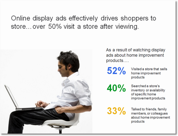
Let's try a different company, and a different example, this is so pervasive, it is not that hard to find these…

Aren't these people in a home already? If you insist on using a picture, should you not use one of some young hipsters searching for their home? Or, at least getting a pre-approval for a loan?
(Don't even get me started on a rant if 31% is higher or lower than in the past, or the two numbers are off different bases – something hard for people to catch, or… other data things.)
Or here's one that takes the cake… a profoundly dis-interested young (hipster-ish) man, thirsty, sitting on a park bench… representing data that is about how far away he is in his living room from various devices!
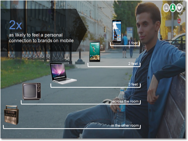
If you are wondering WTF, you would not be the only one.
Just think of how crazy this whole slide is.
Ignore the fact that the Analyst is implying that the reason we feel 2X more personal connection to a brand is because these devices are simply closer to us physically! #omgomgomg
Ignore the fact that the person who created this slide was likely born 50 years after those radios and TVs ceased to exit on planet earth. (If you want to denigrate other channels, don't let's your distaste be this obvious.)
Ignore all the other issues. I just want you to feel how terrible the whole use photos to communicate the emotion of your data point strategy is when you shine even slight light on it. Because, you can't control what people will read into your stock photos.
And, do I need to even tell you how profoundly sub-optimal this is….
No, I don't. Just bathe in it's awfulness.
And, promise me that you are not going to do this for as long as you live.
If you need one last push, let the philosopher Mr. Vince Vaughn make the case for the awfulness of stock photography…

You are an Analyst. Your job is to communicate the data story as simply as you can, but no simpler, to expose the why and shift the conversation to the so whats you've identified. Try and eliminate everything that is getting in the way of that. Including time you spend hunting for the optimal stock photos.
#8. Leverage proportionality for higher-impact stories.
This is one of my favourite stories. It is hugely impactful. It truly shows something amazing. Except. It does not.
There are many standard data presentation strategies you should use all the time. Like. Don't make the difference between 1.4% conversion rate seem extraordinarily bigger than 2.4% conversion rate (it might not be statistically significant!). Representing things proportionally is one that you should try and follow as much as you can. This story is a great example of that.
The smart Analyst is trying to show something important. It turns out, lots of people who search on Google, in this case, and visit your website, also visit your store where they also make additional purchases. If you want to think about accurately valuing your search investment, you should also take into account this offline behavior. So cool.
To prove this out, an amazing effort was undertaken where online ids were matched with offline behavior and offline outcomes were computed. As you can imagine, not everyone who visited the site could have their id properly matched (cookie issues, and more). No biggie.
This data is the resulting output. It follow the very common house metaphor to show the data… see if you can understand it…. do you think the behavior shown is valuable if this were your business….

If you are super into data, you might see how powerful the story is. If, like me, you are a normal person, you might not quite grasp how fantastically amazing it is. And, it is all the fault of how the data was visualized.
Here's a simple way to understand the problem. Look at the slide above. Only 21% of the click ids matched to the provider's cookie pool. But, does that yellow box show 21% of the blue box?
Nyet!
Continue the rest of your visual analysis in the same manner.
The house picture is broken. And, hence, in the end it fails to communicate that that 20 million is a big freaking deal!
Try this, and again when presenting we would have one color show up at a time so that you can control the story and build the suspense, instead…. we make sure we size the boxes proportionally…
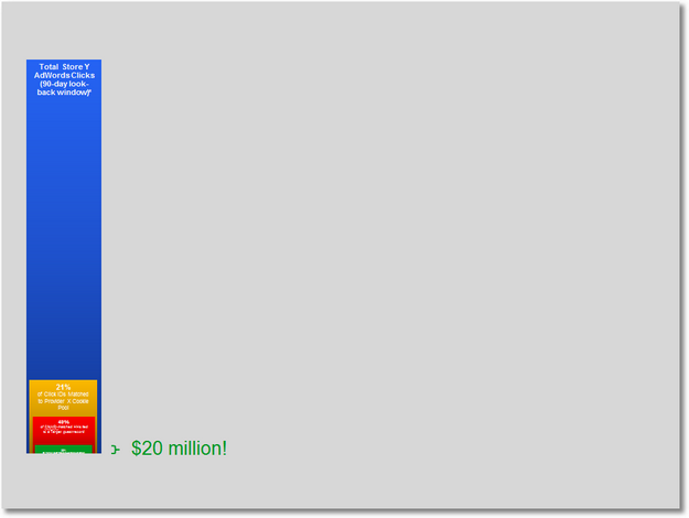
Only 21% of the ids were matched to the cookie pool, of that less than half, 49%, were matched to people's accounts in the Store's CRM system, and of those only 22% had a conversion.
Even with such a small red box matched of all the blue people, the Store made $20 million offline!! It is a safe assumption that if the yellow box was bigger (better matching), and/or the red box was bigger (better matching), the real impact on store sales is much, much bigger than $20 million.
With the original visual, you don't quite communicate that in the worst case scenario the Store is making an additional $20 mil in offline sales. With the above slide, even with the tiny unreadable font, you do make that much more clear.
The conversation you power with the above version will immediately shift to the so what, in this case for the AdWords strategy. The house looked cooler I suppose, but it is a lot less effective.
Use these standard data visualization approaches to communicate more effectively to quicker internalization of reality.
#9. Look beyond the obvious, really look.
Very often at Analysts and Researchers we are so into the data, slicing and dicing it, and in trying to get something decent out of that work, that we fail to actually see the data. See as in really look at it. We have our table, our graph, our slide, but we don't look at this final output to see beyond the obvious things to find something a lot more interesting that might be lurking below the surface.
This is one such deceptively simple example, and I get to make fun of myself.
We all know that real pies are yummy, data pies are yucky. Two data pies are especially yucky.
Just look at this example where all decorations and design elements have been removed. Grab your Post-It again, take some notes on what you think is wrong with this slide, and what you might do differently.
Even if the fonts and numbers were larger, it is extremely difficult to compare the slices (despite three big shifts).
What makes the job harder is that there are too many segments, when there seem to only be a handful that are material.
I'm confident you ditched the pies immediately.
So, what was your fix?
Mine was simple. Just make a table. Why make things any harder?
Here's my delightful table…
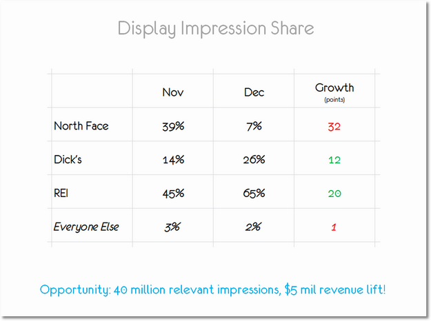
You can see the names clearly, you can see the numbers! I even color coded the growth, and did not percentage percentages! (See rule #3 above.) And, I even reduced the number of data points.
And, you know how obsessive I am about this, I even have the so what.
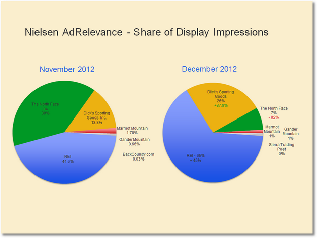
I felt pretty good about this. Until I saw Lindsay's version.
Here it is…
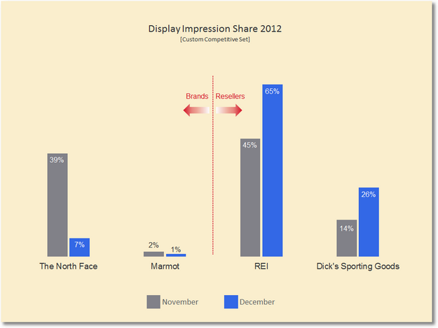
She saw something that was not obvious, something right in plain sight, something absolutely amazingly critical.
There was a stark difference in performance of brands and resellers.
When you see Lindsay's graph, I'm sure, like me, you hit your forehead with a big Doh! Because that's the story. That's the big point.
And, it is important because it will lead to very different so what actions, a very different conversation would ensue, than if you'd used my fixed version.
Make sure you take time to look at your most important data. Really look at it to see what it is saying. Pattern yourself to look beyond the obvious. It is not easy, it takes time to get good at this. But get good you must – as Yoda would say it. :)
#10. When faced with a data puke, pick focusing facts!
Sometimes in life, you have no choice, you have to puke out a bunch of data.
Here's a good example of one such slide…

Ooof! That is a lot of data!
It actually does not matter how good or bad it is, there is no way anyone will actually understanding anything. Just look at all the trends.
When faced with this much data two things will happen: 1. People will stop listening to you and start wondering if their Ashley Madison profile will be discovered in the data leak. 2. Start asking you random questions about any random thing/trend that catches their fancy (How come so many more people have heard of Ram when compared to Jeep?).
Your goal in these data puking scenario is to get to a focusing fact very quickly, and remove the data puke from the slide.
I have a couple of go to strategies in these cases.
My favourite one is to get them focused on the competition. There are so many companies on the slide. I'll pick a competitor or two that our company/client is really worried about, and a competitor or two that I think they should really be worried about (great way to push Sr. Leaders beyond their blind-spots).
You show your data puke, click, eliminate everyone except those that fit the categories above…

The conversation will immediately go to the worried about/should be worried about competitors. Why are they at x and we are at y? What do we need to do differently to crush Toyota? OMG, how in the world did those newbies at Kia get to be so x at y?
All really good things. Quickly off the puke and on to the so what. Make sure you are ready with some recommendations there.
(A very small thing, but I love balance on slides. I hope you see that in all the after examples in this post. In the slide above, I moved the legend to be center-aligned with the graph. Small thing, but it taxes the audience's brain a little less.)
My second strategy when faced with a data puke is to pick a trend/thing as my focusing fact.
In this case, the most desirable outcomes are represented by the purple and the green, and hence I choose them…

Just add a white box, transparency set at 11% on the rest of the trends and you have yourself a discussion point. The conversation will focus on what our competitors are doing to be so much better at the purple or the green, and what we can learn from them.
(While that discussion is happening you'll have a panic attack as you realize that this data is quite likely suspicious because for that many people to say they love Chevrolet and will stand up for the brand seems quite illogical given who else is on that list! A good use of focusing facts rather than just looking at the whole data puke!!)
I'm sure you'll have your own go-to strategies for picking your focusing facts. What's important is to have an arsenal of these ready because you will have to use data pukes on some extremely rare occasions when Mercury and Pluto are in perfect alignment. Even on those rare occasions you'll be ready.
That's it, ten rules to help you simplify the story you are trying to tell with data, to help you bring focus to drive the conversation about what to do, powered by an obsession about business outcomes. It is hard to accept that the job of an Analyst is to move the conversation off the data as fast as you possibly can, but, trust me, it is. The rewards of that strategy are immense and gratifying.
We started the post with a cartoon by Tom Fishburne, let's end with one as well..

Admit it, you've not only said it but actually worked hard to find said "unbiased" data!
As always, it is your turn now.
Surely you don't agree with all the after versions. Which one do you dislike the most? And, to be fair, which one do you love the most? If you had to redo one of the before versions, care to share your after version? I'm confident some of you passionately believe in limiting the number of slides and blame PowerPoint, care to share what powers that passion? If you use stock photos or icons, why do you stick with them? If you had to add to my list of rules for storytelling, what would you add?
I would absolutely love to see your examples, hear your critique, listen to your praise, and alternative points of view. Please share them via comments.
Thank you. Go out and tell amazing stories with data!
To view the original article Click Here
No comments:
Post a Comment